User Experience Guide
Download your free copy

We know that a well-designed e-commerce website can attract and retain customers. Therefore, we have compiled a short list of the best tips for designing a frictionless shopping experience. Read it all below or download the PDF.
The homepage is a crucial part of any e-commerce store because it represents the main point of entry and is a site anchor for users throughout their browsing session. Whether it's for the first time or the 27th, users looking at your homepage must clearly see how to browse through the various categories of your site, search for a specific product, and access special features such as new and recommended products.
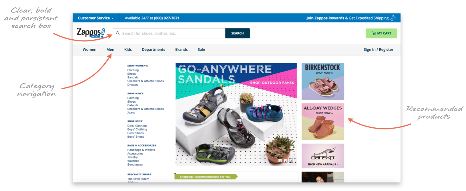
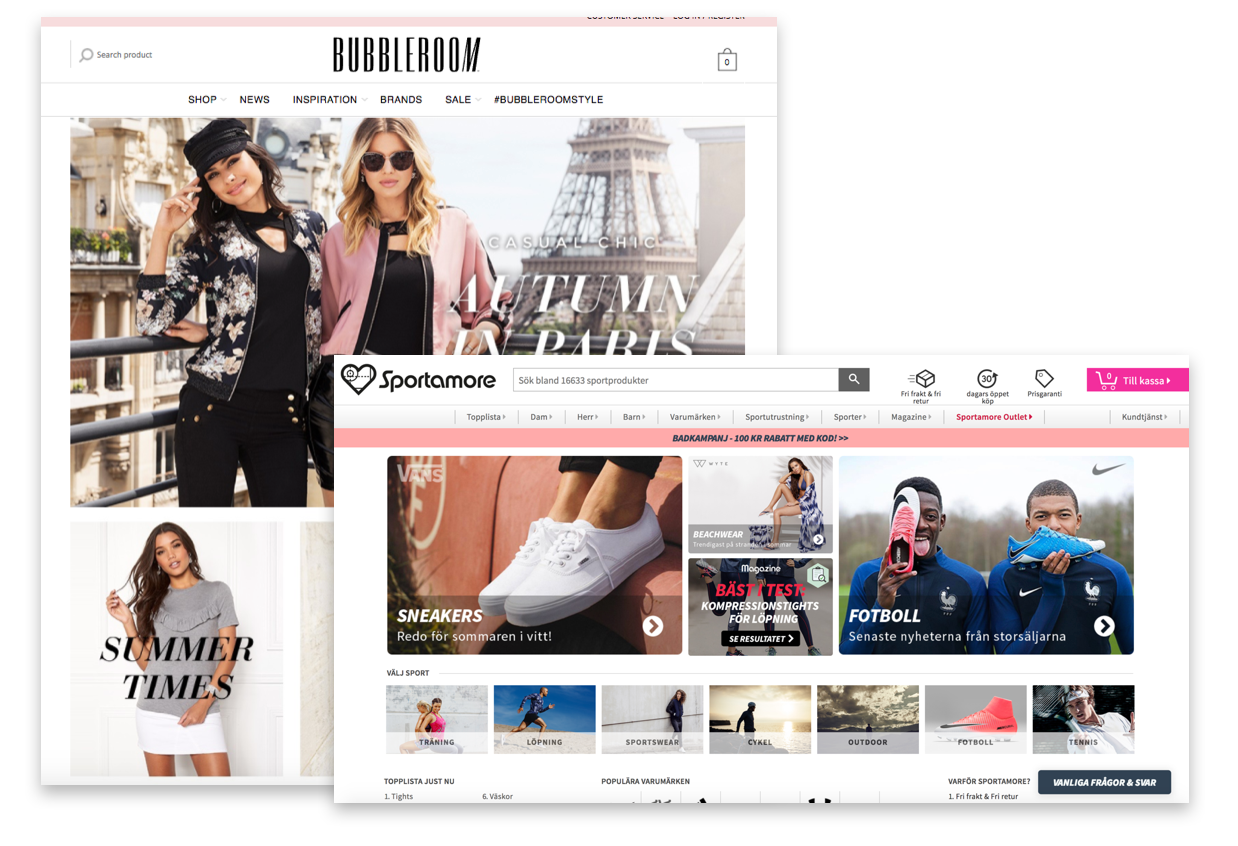
Bespoke imagery and design elements such as attractive photography can go a long way in creating a great first impression, making it more likely that users will stick around.
Personalised content such as recommended products also helps, although personalisation shouldn't dominate the homepage or affect how users navigate the site.
Download the PDF Version
If the homepage of your e-commerce store is like the cover of a book, inviting people in to browse awhile, then your site's product categories are like the spine and the table of contents all at once, holding everything together and providing a clear infrastructure. Any good e-commerce store has a carefully designed category structure at its core.
1. Filter things out: It's important to distinguish between categories, filters and facets within your taxonomy. Categories are mutually exclusive divisions that separate products into distinct groups. Filters use certain product metadata as visible criteria visitors can use to refine their search queries. Facets (also called faceted filters), on the other hand, are used to window down the products available within a category based on the qualities of that product. Essentially using multiple filters simultaneously.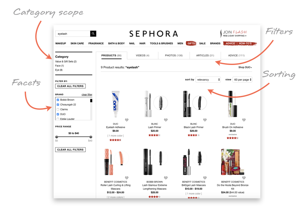
2. Accessorise: Shoppers typically expect that accessories will be contained within the relevant top-level categories rather than form their own. Computer accessories such as mice and cables, for example, should probably be found under the "Computers" category, in a subcategory next to "Laptops," "Desktops," and so on. However, this is often industry-dependent – clothing retailers often have a top-level "Accessories" category with subcategories for watches, belts and socks.
3. Repeat yourself: In the interest of creating a fluid shopping experience, subcategories can be duplicated if it makes it easier for users to find what they need. For example, a subcategory for “Tables” would likely belong under both the "Bedroom" and "Living Room" categories.
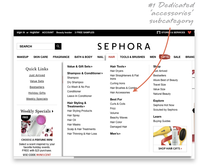
4. Break the mould: Your taxonomy doesn't necessarily have to adhere to a strict scientific division of your store's products. Consider adding a "New Arrivals" filter to highlight interesting new additions to your store.
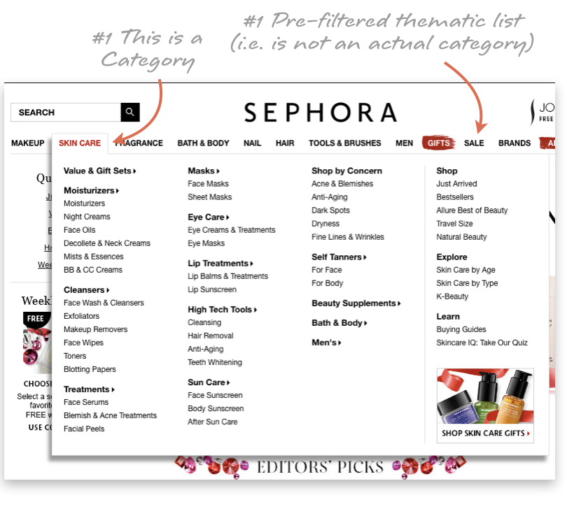
Remember: Do not confuse filterable product attributes or product “states” (e.g. What's New, Bestsellers, Sale, Gifts, Just Arrived, Brands) with actual categories. Categories are mutually exclusive, filters are not.
You can link to pre-filtered lists from the top-level menu (i.e making it seem like a category to the user), but do not actually make these attributes categories in your data structure. Doing so will severely deteriorate your search and recommendation engines. General rule of thumb: if there are less than 30 items in the category, consider using it as a filter instead.
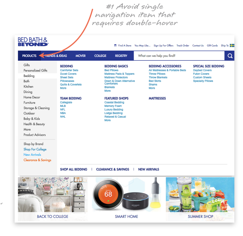
1. Make categories clear: Instead of a single navigation item labelled "Products" or "Catalog," use a navigation bar that lists all of the categories together and is immediately visible to the user. This avoids problematic "double hover" issues that make it necessary for shoppers to carefully navigate the drop-down menu in order to find the subcategory they want. In addition, explicitly listing all product categories makes it clear what kind of site and store your shoppers have arrived at.
2. Keep things consistent: If you use a drop-down menu, it should be available at all points within the scope of a category, since shoppers may want to browse multiple categories throughout a single session. Site-wide navigation pages, including "Customer Service," "Shipping" and "Return Information," should be distinct from your category navigation bar and available from every page in your store.
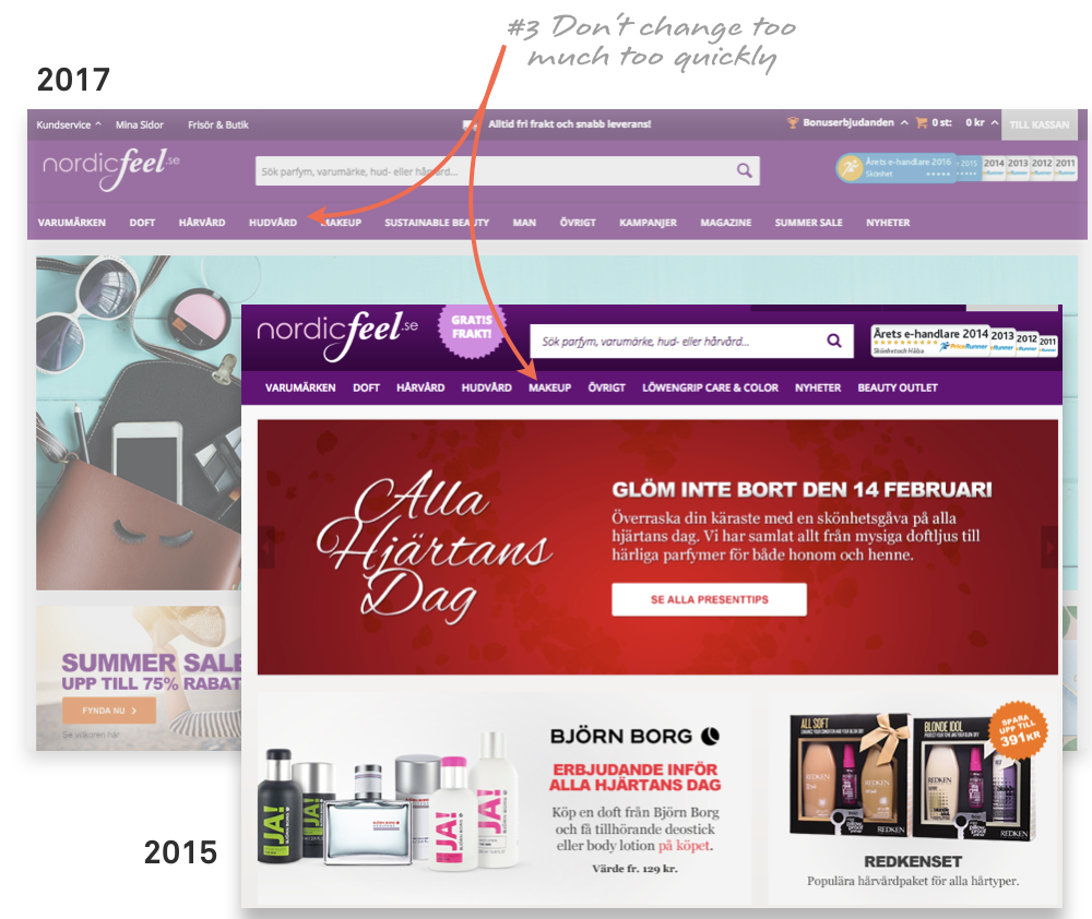
3. Don't change too much: Conceive and design your main navigation well in advance of launching your site so that you avoid confusing shoppers with constant changes. If you use visual anchors to identify your categories, they should be representative of all products that can be found under each category, and should only change in the event of a drastic site-wide redesign.
Traditionally, a product list page (category listing page) displays items in a list, with information such as the product name, image and a link to the product's individual page. A well-designed product listing page needs to strike a balance between providing enough information to distinguish the products and providing a simple, clean interface for users to browse.
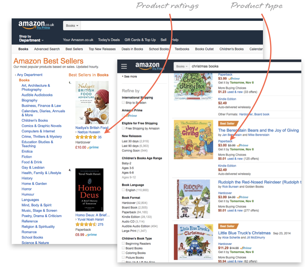
1. Display the essentials: Your product listing page should provide just enough about each product's attributes to distinguish it from the alternatives — and no more. After all, if shoppers are interested in a product, they can click through to its individual page to find more information. An item's price is an essential datum that should always be included in the product listing page. Other fundamental attributes include the title, thumbnail image and product type.
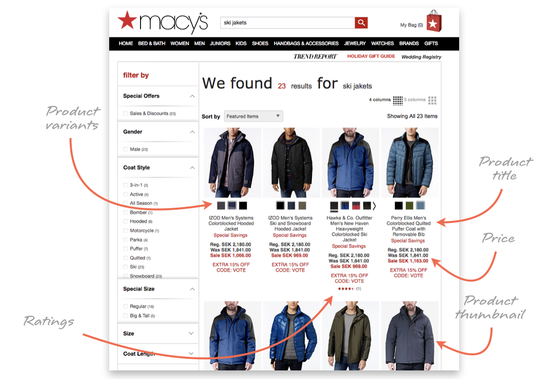
2. Let them compare: If they can't easily distinguish between the various products on the page, your users will be overwhelmed while browsing. Your product listing page should display attributes that help users figure out how relevant an item is to their search (e.g. compatibility, dimensions, appropriateness).
For example, if you have several similar products of different sizes, show the dimensions of each product in its listing. A product's average rating is also a key attribute to help many shoppers to narrow their search.
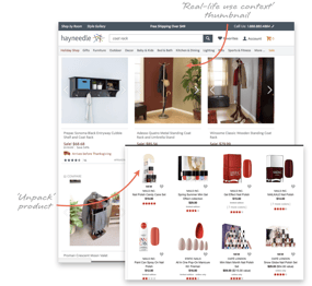
3. Pictures are priceless: Many users are visually driven and rely on product image thumbnails while browsing. Thumbnails need to be unambiguous, unique and distinctive. Displaying the unpacked product, rather than the product packaging, is usually a smarter choice. Consider displaying a secondary image when the user's cursor hovers over the item. For example, if the main image is the product against a solid background, the secondary image should show it in its real-life context, and vice versa.
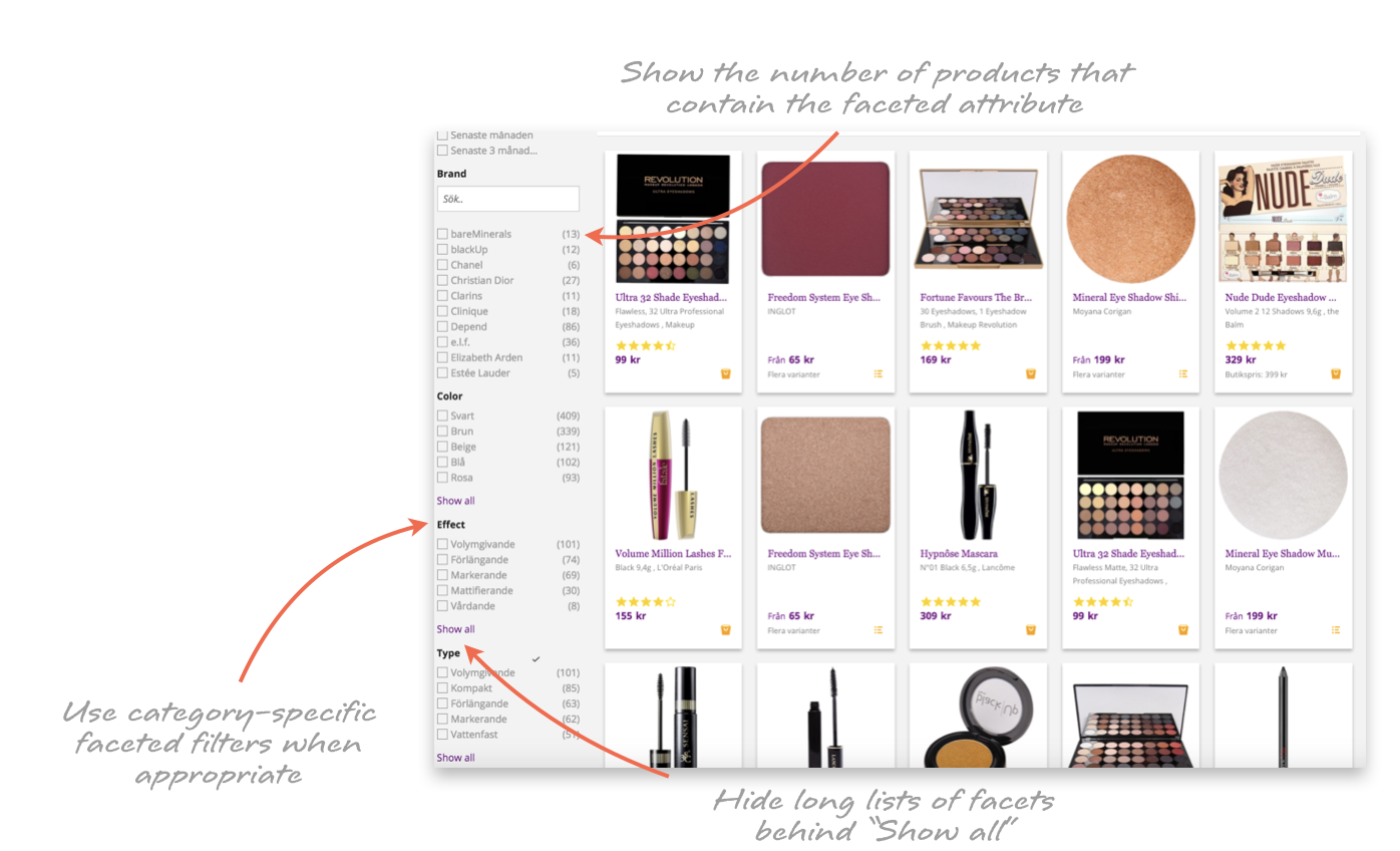
4. Window things down: Instead of hunting for a needle in a haystack, shoppers can use faceted filters to find the few items that are most relevant to them. If a piece of information is important enough to include on the main product listing page —colour, average rating or price — then it's important enough to filter by.
You should also include category-specific filters, such as effect for eye makeup category, when it makes sense to do so.
So, you've put some serious effort into making your homepage, taxonomy, navigation and product listings clear, well-designed and user-friendly. Your job isn't over yet, though: You also need to consider how your general site-wide elements will be displayed and positioned. Your e-commerce site needs to make it easy for users to get around the website and find sections such as customer service, shipping and return information.
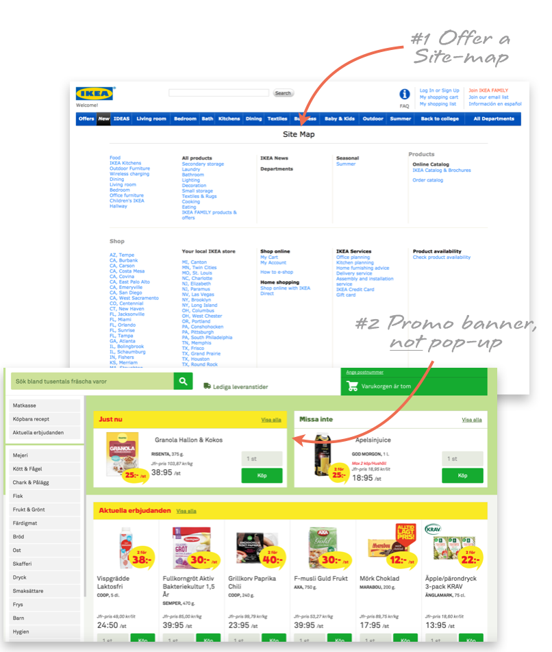
1. Map things out: If your best efforts fail and your users get hopelessly lost on your site, you need a way for them to hit the reset button. Create a sitemap that shoppers can consult in order to get a bird's-eye view of your site and its product categories. The sitemap should include all of the top-level categories in your taxonomy as well as the next layer of subcategories.
2. Get out of their way: Users tend to become frustrated at any interruption to their shopping experience. Overlay dialogues and popups asking the user to take a survey or sign up for a newsletter are generally seen as an ineffective annoyance. Instead, use banners and ads to place this content within the page where users can't remove it. In addition, forcing users to create an account before browsing causes many would-be shoppers to abandon the site or enter fake login details.
Although the importance of site navigation is hard to overstate, shoppers rarely follow a simple, straightforward path through your site when browsing. Instead, they often go back to previous pages, look for related products, move to a different category, or just start over entirely. Your site should anticipate this behaviour and make even the most scatterbrained shopper feel at ease.
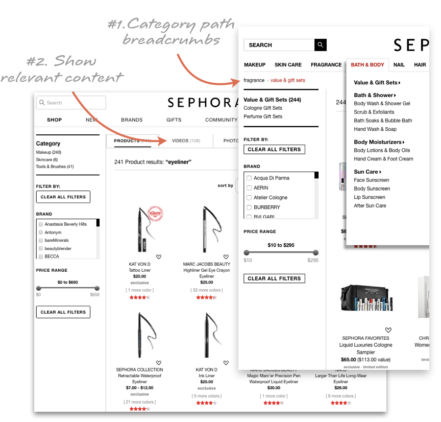
1. Leave breadcrumbs: Shoppers might arrive at an individual product page in any number of ways. Instead of forcing them to use their browser's back button to leave the page, insert "breadcrumb" links that help them navigate elsewhere on the site. These links can be hierarchy-based, showing where the user is in your site's taxonomy, or history-based, showing the user's recently viewed items or search results.
2. Create connections: If you've built content such as product guides for your site, make sure to add relevant links in the text between the different pieces of content, as well as from the content to the appropriate products and categories. Allowing shoppers to cross-navigate throughout your site's content encourages exploration and discovery.
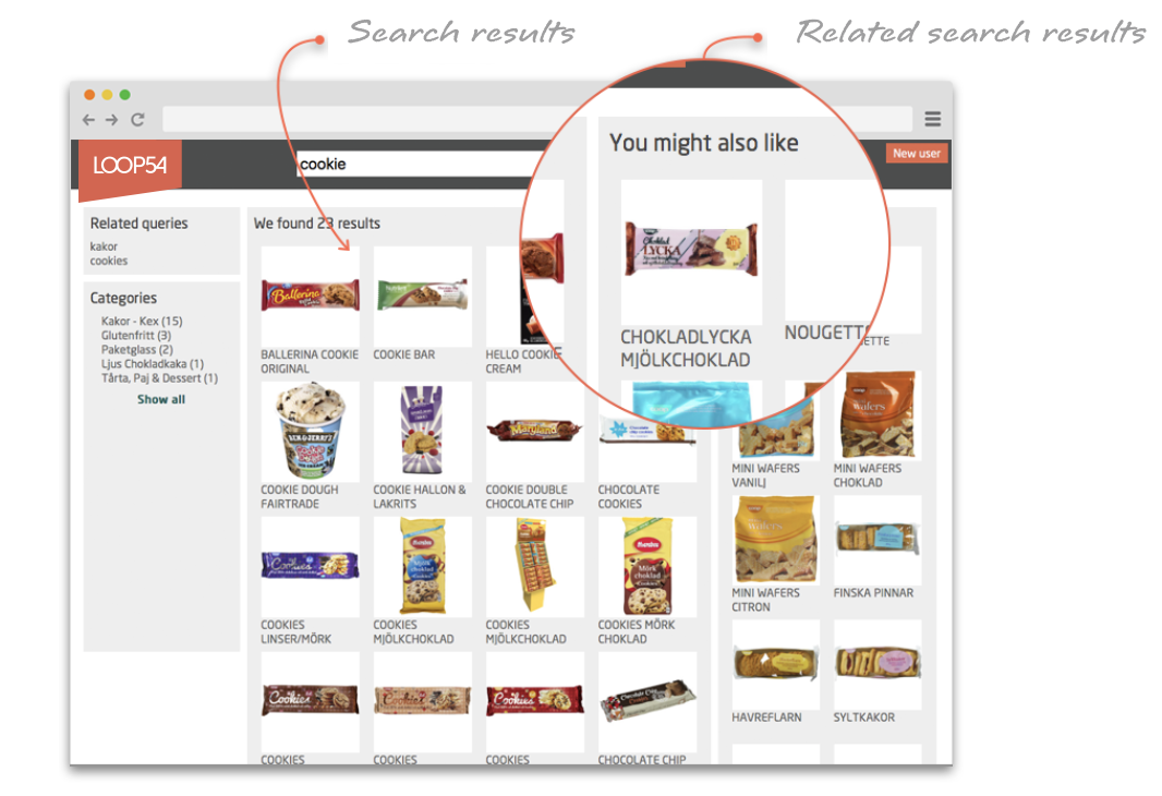
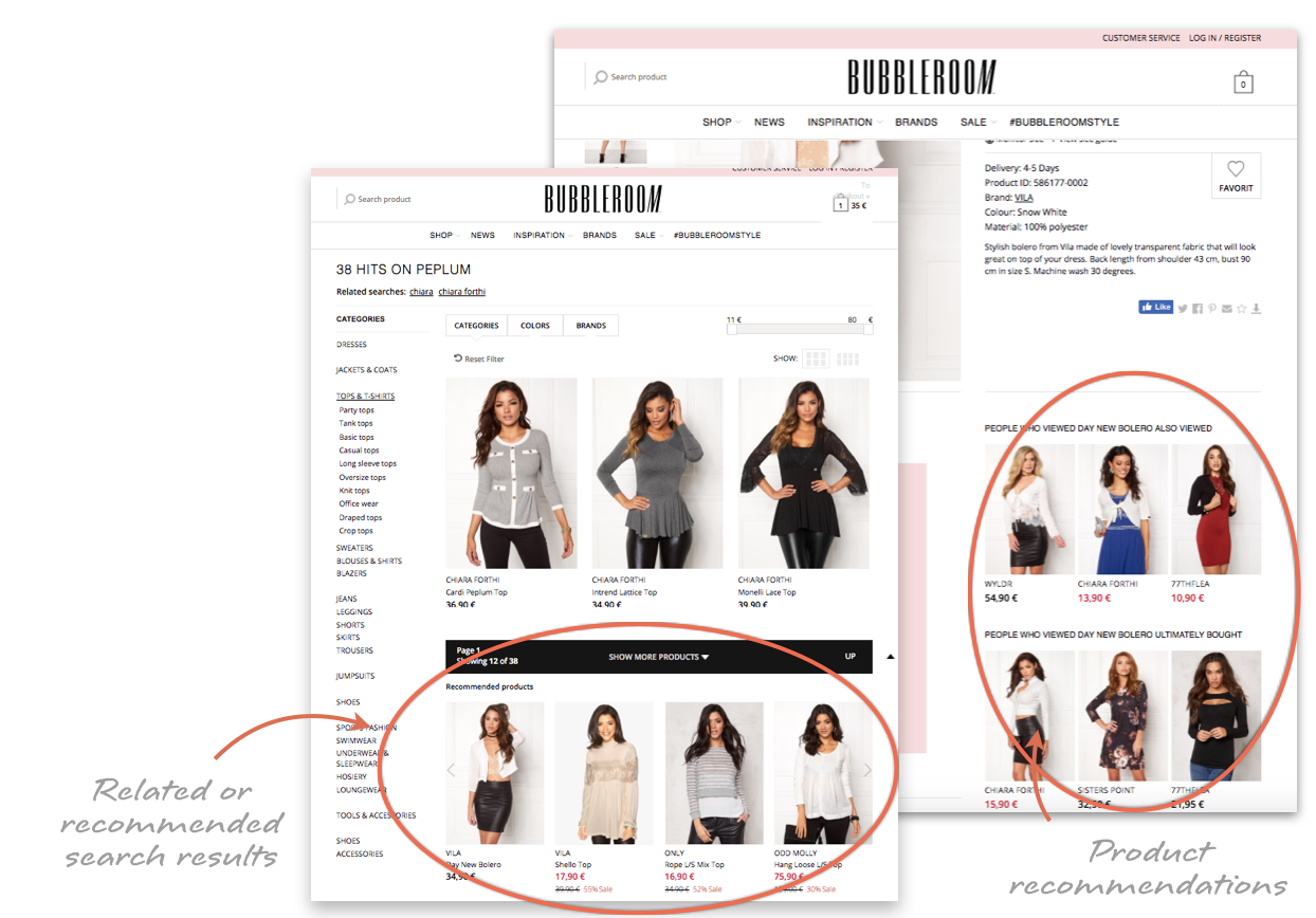
3. Make suggestions: You never want to miss the opportunity to make another sale, and your site's design should reflect that. Recommend related, similar or complementary items on the product page, at checkout and within search results.
Sources:
E-Commerce Usability: Homepage & Category, Baymard Institute
E-Commerce Usability: Search, Baymard Institute
E-Commerce Usability: Product Lists & Filtering
E-Commerce User Experience, Vol. 5: Search, Nielsen Norman Group
25 effective design patterns for eCommerce site search results, EConsultancy
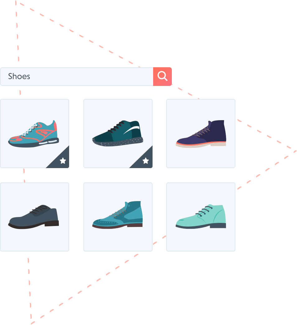
A collection of the best tips and tricks for creating a frictionless shopping experience.